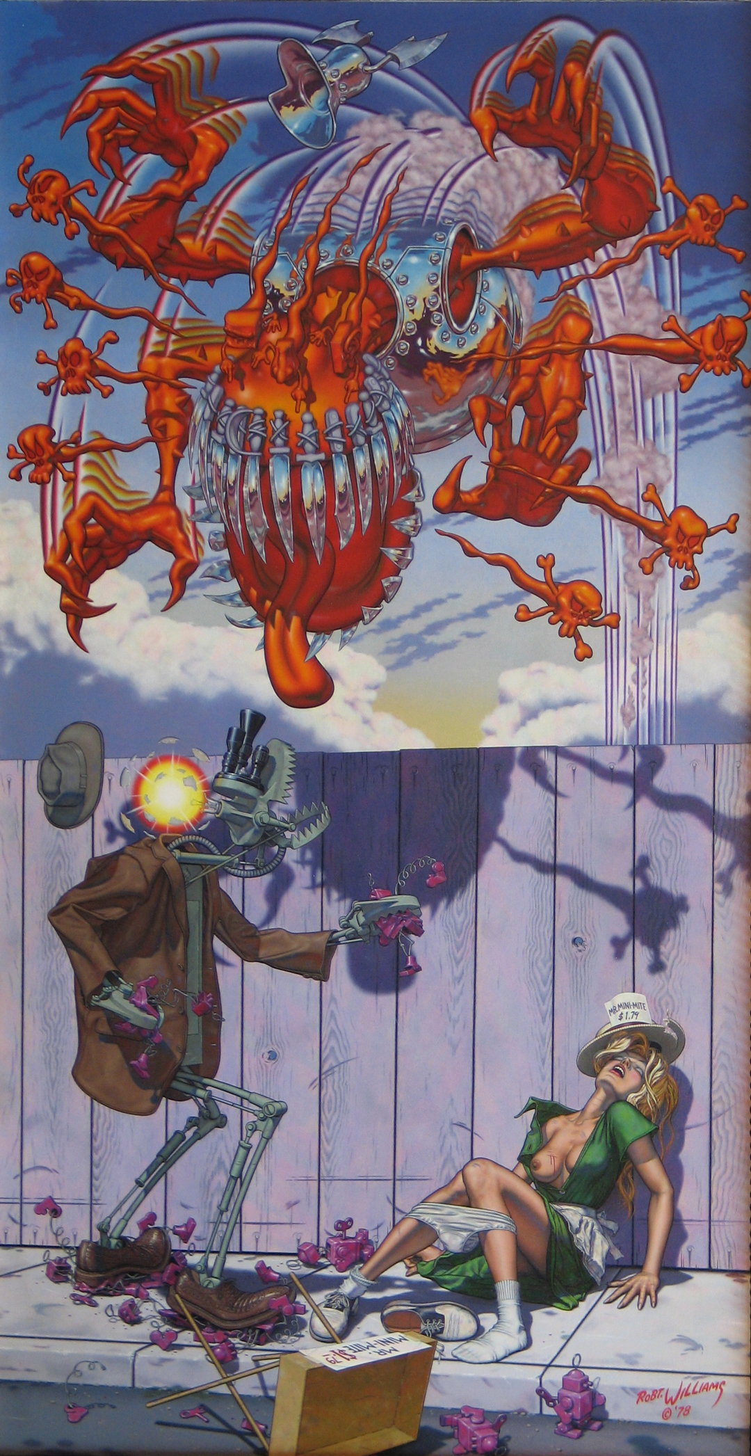
A woman lying in an alley. One breast poking out from her blouse, one shoe askew below her underpants which are pulled down to her calves. Robert Williams’ 1979 painting titled “Appetite for Destruction” also depicts a robot rapist and a giant ghoul adorned in skulls, bones, and knives seemingly about to exact revenge on the robo-rapist.
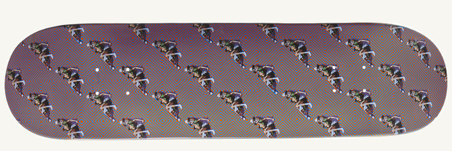
During a recent trip to Fucking Awesome’s webstore, I noticed an Anthony Van Engelen deck bearing a repeat pattern of a detail taken from Williams’ controversial painting. Without the robot and vengeful ghoul, the graphic shows only the sexually assaulted woman 30 plus times cast against an eye bending background. Is the message here supposed to be something about the pattern of rape culture? Is it an artistic statement of some sort? Or maybe it’s “just a graphic, man – stop reading into it!”?
We all know there’s truth to the cliche that “sex sells,” especially when you’re market is made up of horny adolescent boys, and Fucking Awesome is another company in a long line of skateboard brands that have employed sexually subversive imagery to sell their products.
But what exactly is being subverted in the Fucking Awesome “Appetite” deck is questionable and up for discussion.
To better understand the cycle of appropriation the Fucking Awesome deck is a part of, let’s look at another instance of Williams’ painting being used to market a product. In 1987, Axl Rose approached Williams to ask permission to use Williams’ controversial painting as the cover art for Rose’s band’s first major label release, also titled “Appetite for Destruction.” Williams warned the young Rose that the image would be received poorly out of context, and may even be banned from store shelves. Low and behold, when Guns N’Roses released their album with Williams’ art, retailers refused to stock it and the label replaced it with the now iconic cross and skulls image.
”Williams has criticized the pop-art movement, saying it’s limited to repurposing other people’s original ideas – much like the Fucking Awesome graphic.”
Robert Williams’ art is praised and considered “art” because his lowbrow modern images are executed in a classical style. His “Super Cartoon” series (of which “Appetite” is a part) takes the pulp comic imagery Williams grew up on and spins it into something that can be considered high-art.
Using the techniques of the Renaissance Old Masters, Williams worked with hand-made oil paints and multiple layers of varnish to painstakingly create classically composed paintings of inherent contradictions: robot rapists and sexually assaulted women painted with enough skill to rival Raphael. They sold well, and have managed to transform the limits of high-art’s content. He considers himself a surrealist rather than a cartoonist or pop-artist. In fact, Williams has criticized the pop-art movement, saying it’s limited to repurposing other people’s original ideas – much like the Fucking Awesome graphic.
This is important. Despite the violent, sexual, and often perverse images he employs, Williams has always been aware of context and audience – the differences between high-art and commercial art. So, what the hell does that make the Fucking Awesome graphic? Well, since the image has been appropriated and decontextualized into a mass market commodity, it’s closer to pop-art than anything else.
Also, like many modern skate graphics, it’s also kind of arbitrary – an image meant to say “fuck you,” but without really addressing why.
Subversive skate art doesn’t have to be so derivative or seemingly empty of meaning as the FA “Appetite” board though. Marc McKee’s graphics from the early-90’s are the perfect example of creative, often-obscene images that do more than give the viewer a quick laugh or shock. McKee’s colleague, Sean Cliver (who has his own spin on subversive skate graphics), lauded McKee’s ability to make meaning out of obscenity. “McKee had a knack for making a graphic more than just a naked chick – even if it was just a naked chick,” says Cliver. “He would always find that one detail to make it relevant to the company or rider, or at the very least make it funny.”
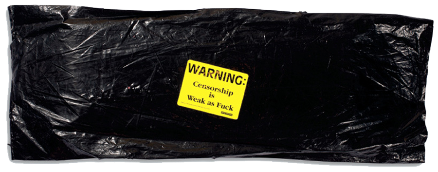
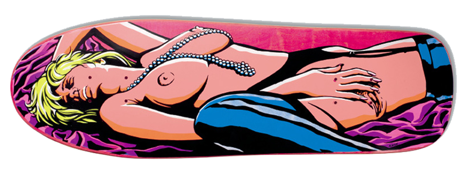
Check out the board Marc McKee designed for World Industries’ Randy Colvin in 1991. Sold in a black plastic bag bearing a sticker that read “Censorship is Weak as Fuck,” the graphic featured a full-on female masturbation scene. Skateboards in 1991 had never had full frontal nudity before, and the packaging was a brilliant take on those clandestinely wrapped porno mags found at bodegas and newsstands around the USA. Kids can’t buy porno? We’ll give them porno!
”Kids can’t buy porno? We’ll give them porno!”
The graphic itself is interesting not just because it featured a sex act, but also because it featured a woman pleasuring herself – no man, or skater boy, needed. It could be argued that Colvin’s board was tasteless, but it’d be hard to press that argument to say that it had no meaning at all. It’s message commented on the status-quo of skateboarding culture at the time, feeding the adolescent male desire for the consumption of pornography while presenting an image that shows a female personally exploring her own sexuality outside of the traditional male-female hierarchy.
Taste and meaning are always going to be changing based on the viewer’s social climate, cultural awareness, and the ever changing societal norms they live within. Art’s meaning is subjective and personal, and it’s up to the individual to make up his own mind about an image’s value.
Personally, I’m probably never going to buy a deck with a naked girl or guy on it, as that doesn’t appeal to me, but that doesn’t necessarily mean it’s valueless. Context is key for an individual to engage with an image’s meaning, and the Fucking Awesome “Appetite” deck, devoid of the high-art techniques of Robert Williams’s original, or the intelligent self aware humor of Marc McKee’s work, seems to be rehashing the same decades old shock tactics with no greater intended meaning. If you chop the dick off Michelangelo’s sculpture of David and slap it on a board with no commentary, it’s just that: a cock and balls.
It leads one to wonder what could possibly be controversial and subversive in today’s skateboarding culture. We’ve done the sex, the drugs, the violence, the corporatization… How can skate artists continue in the tradition of Robert Williams, Marc McKee, and others if there’s nothing new to subvert?
Related Posts
Comments
Popular
-
 MY EXPERIENCES IN SKATEBOARDING
"I've been terrified of garnering the reputation of 'ramp-tramp' or 'pro-ho' just from spending time with skaters."
-
 WHAT WOULD MAKE SKATERS DITCH THE BIG SHOE BRANDS?
We asked younger skaters how small shoe brands could win back their business from the big budget behemoths.
-
 8 ARTISTS REIMAGINE THE INDEPENDENT LOGO
What would an Independent rebrand even look like?
-
 BRIAN SUMNER ON LEAVING THE SKATE INDUSTRY AND FINDING CHRISTIANITY
"People are going to hate you for different stupid reasons, but people shouldn’t be divided over the faith."
-
 UNDERSTANDING THE NEAL HENDRIX ALLEGATIONS & POWER DYNAMICS IN SKATEBOARDING
How can skateboarders within the industry do a better job of keeping each other in check?





May 26, 2015 3:08 pm
This is Bonzing! No censorship.
http://www.bonzingskateboards.com/index.php/home/buy-bonzing-skateboards/buy-bonzing-super-fatty#!/Super-Fatty/p/17492993/category=1188088
May 26, 2015 3:10 pm
Just a cynic saying he’s tired of the same ol shit
May 26, 2015 4:36 pm
You could have just said you don’t like it. Got bored halfway through
May 26, 2015 4:57 pm
An obvious and lazy attempt of cashing in on popular culture while trying to remain relevant as a ‘counter-culture’ brand. Yes FA has ‘fucking’ in it’s name so it’s got to be super core (sigh), yet this graphic is more akin to the early nineties days of throwing whatever Looney Toons characters or Burger King graphics on a board because it’s quick, easy, and will sell. The fact that it has decimated the original artwork and stripped all meaning from it is I’m sure the last thing on the creator’s minds because skate graphic history has a long era of stealing art for profit. Because that’s what the early nineties were-not giving a fuck, which is the basis of FA’s entire branding. Skateboard graphics can and still be really subversive and impactful when they are made by artists who give an actual fuck and have something to say. Fucking Awesome has done some cool stuff but this is about as cool as Jason Dill on the Osbournes. And about as relevant as a Powell Mini-Logo. Apologies to Rob.t Williams for this turd.
May 27, 2015 5:27 am
all of which begs the question, who gives a shit?
June 1, 2015 12:36 pm
I do Neil #2, I do.