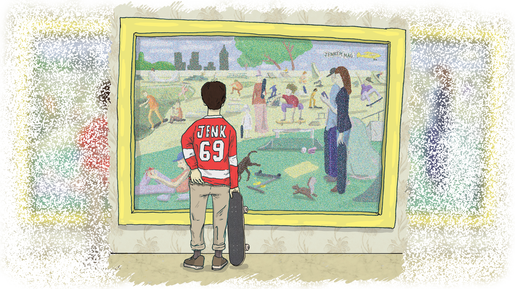
The responses to “What Does a Real Art Critic Think of Skate Art?” — both positive and negative — were overwhelmingly intrigued, so we’re hitting you with Round 2: Critic vs. Skart. Again, we asked Shana Nys Dambrot, an LA-based critic with a deep CV, to speak on iconic works from some of our favorite skartists.
Given Shana’s background in creating and critiquing art in the “real” world, she’s a perfect fit to offer an unbiased perspective on skateboarders’ artwork. So when she looks at one of Chad Muska’s sculptures, her response isn’t swayed by a too fond memory of a Muska Flip.
Without sharing any background info on any of the artists with her, we sent Shana a fresh Dropbox link and got her honest opinion on works from a new batch of art made by famous skateboarders (this time, with audio too!) Full-on curation mode baby.

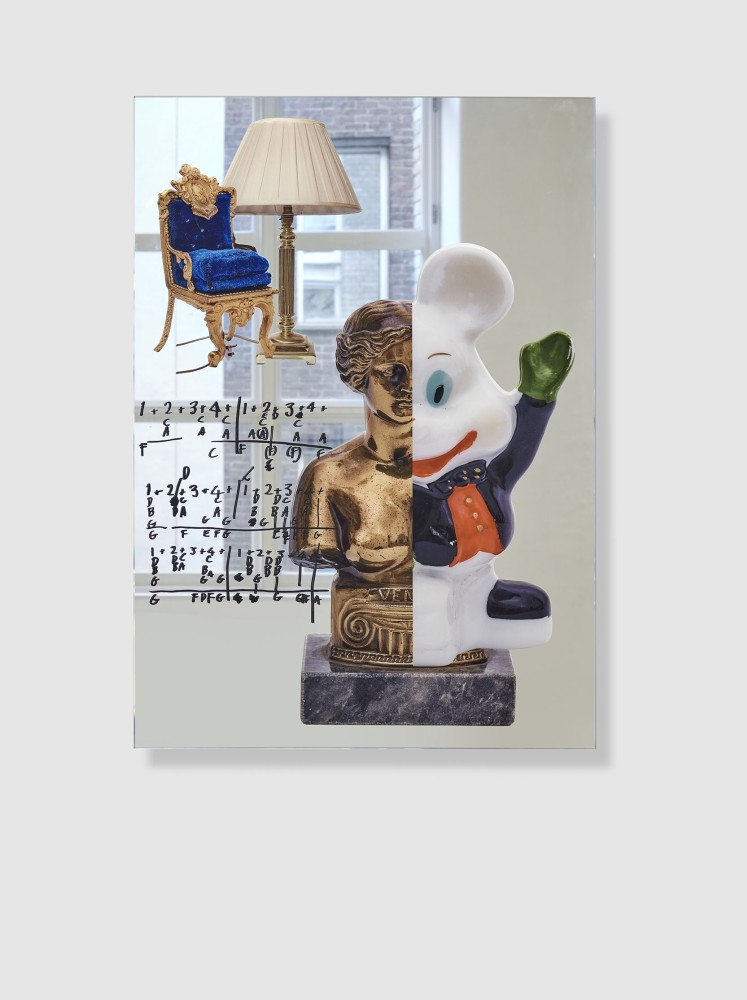
BLONDEY MCCOY – OSCILLATE MILDLY
I actually find this image really likeable.
Photo-collage can be amateurish and it’s often sloppy, and in a way it’s risky to only incorporate relatively few elements as this artist does. With such a limited number of juxtapositions and no exceedingly intricate or skilled detail work in assembling the cut pieces, the artist doesn’t really have anywhere to hide in the picture, and the small amount of sources they use need to be all the stronger for being few in number.
Where I think this picture succeeds is both in that the half-dozen or so images are each crisp and brightly colored, so that you get this slick surface that gives it all an upbeat, Pop Art quality. And then additionally, there are a few neat tricks playing with scale (lamp/chair, statue/toy) and space (the indoor/outdoor window views) that give it a touch of the Surreal as well.
Against this clean brightness, the hand-scrawled math problems do create a bit of visual drama — as well as providing a clue as to a loose narrative of school or academia (reinforced in the historical antiquity of the bust and the opulent fanciness of the velvet and gold chair) in which the past and future are spliced into something like a joke, but a pun rather than sarcasm.

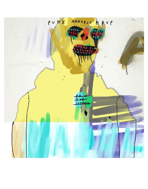
CHET CHILDRESS – PIECE FROM “Cinco De’ Adul”
This one isn’t my favorite. I imagine the artist as perhaps being unclear about the direction of the image, so that it ends up being a bit unsettled or unresolved.
The palette is light and almost subdued, like dark pastels. But the line work of the figure’s shape — and even more so, the handwriting — both feel more frenetic and raw than the mood set by the palette. The words themselves too, which are only mostly legible, and in which the word “freak” is aggressively repeated, feel a bit unresolved. As they function in the composition it seems like the text wants to provide insight into a psychological state or some experience of the outlined figure. However it’s mostly kind of creepy, off-putting, rather than mysterious or the sort of thing that would feel resonant or prompt curiosity to know more of the story.
Overall it feels like a mismatch rather than a juxtaposition, and it ends up awkward. I do like the way in which the artist is looking at both street and abstract painting, but I feel like they could benefit from focusing on a single emotional story per work so that each might have a more cohesive impact.

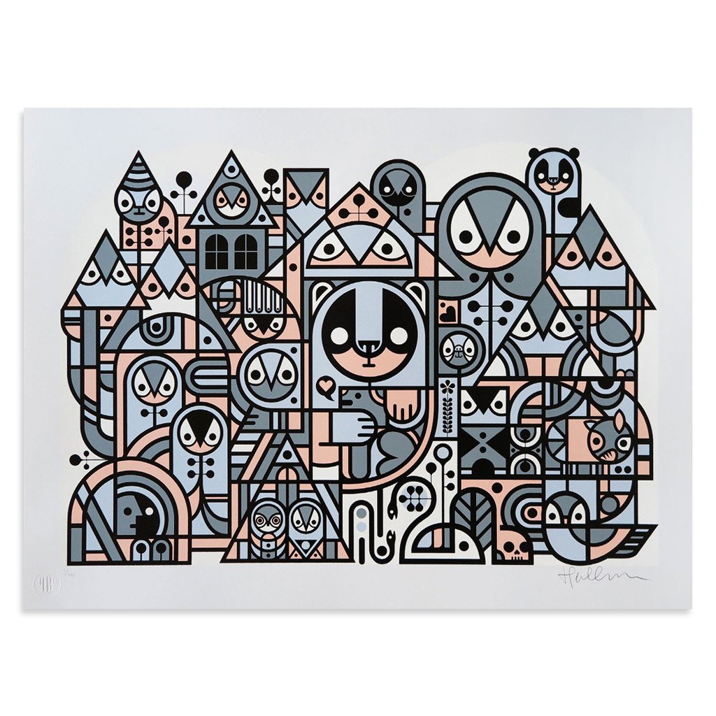
DON PENDLETON – RETURN TO THE KINGDOM
This is adorable, and a little neurotic, which is a charming combination. I can’t decide if I want more or less imagery though.
On the one hand, discovering the animals and people embedded within the lattices of the design motif is part of the image’s appeal. On the other, having that sort of cuteness does distract from the elegance and complexity of the schematic patterned architecture of the structure they’re in. You start looking for piglets and owls instead of appreciating a post-Pop take on architectural drawing and flat-plane abstraction. The colors are quite understated too, which I appreciate because it further flattens the space that the structure occupies and pushes it closer to abstraction.
However, having a sort of winter almost-earthy palette of cold grey, blue, and sienna gives it just a touch of naturalism in terms of building materials — one easily imagines stone, wood, and paint.
Strong graphically, I see that it is a print rather than a painting on canvas and I think that’s a good choice of medium, because the tightness and eccentrically decorative aspects of the motif are well-suited to that.

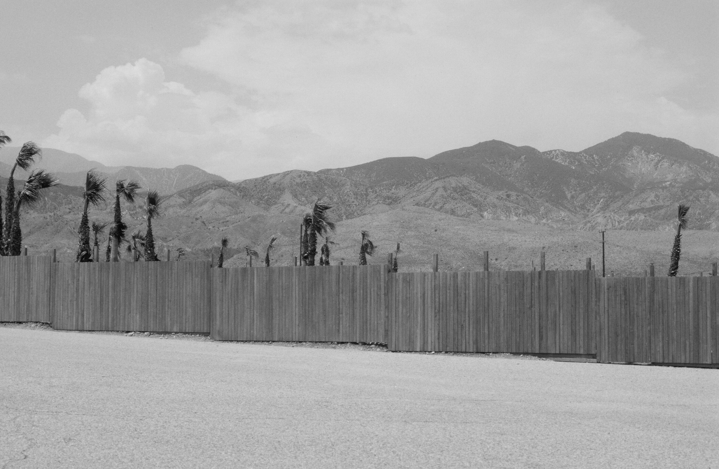
JASON LEE – UNTITLED
Black and white photography of the desert landscape is one of the oldest and most enduring genres in American art — and there are myriad ways to practice it.
This artist seems to be inspired less by the melodrama of an Ansel Adams and more by the quasi-academic notational work of 1970s-era photographers who drained some of the blood out of the Western romantic vision and replaced it with a more analytical eye.
It’s an emotionally reserved way of depicting the region’s contradictions — the incursions of man into the expanse of stony, palm-studded lands, the heights of nearby craggy mountains, the weird scars where civilization meets arid wilderness. There’s a languid randomness to the region which this image captures, and I can see the reason for interest in this scene. Lateral stripes organize themselves in these four jagged rows stacked up to and including the big flat sky. It’s just that the production of the image — mainly the low contrast in its details — makes the image a bit washed out.
I think it could benefit from more expert processing, so that the qualities of light and the features of the bands of texture would be more intense and create more interest and energy in the image.
It has good bones, but it needs a bit of fine-tuning to fulfill its potential.

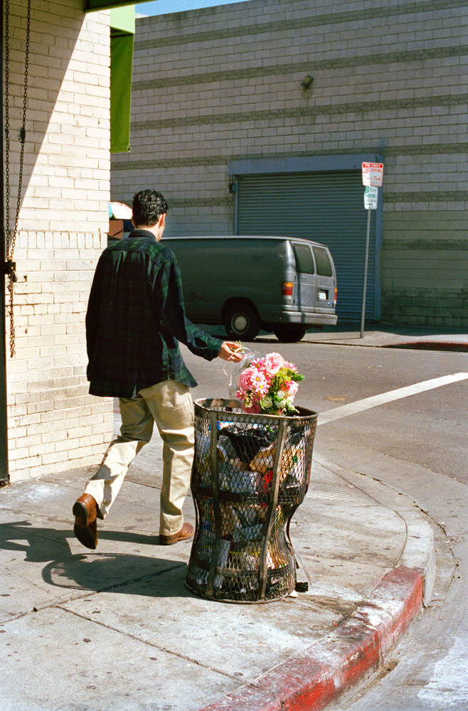
JERRY HSU – UNTITLED
I want to like this more than I do.
The idea is pretty solid. It plays on the vintage conceit of the so-called “decisive moment” in photography, where you see an action with the snap and sizzle of important plot-point, and are inspired to construct its context. The young man chucking a pretty bouquet of flowers, mid-stride without slowing down, cavalierly into a city trash can — it all speaks to that, and he’s captured in mid-toss, his slouched posture amplifying the mood.
The problems start because the scene doesn’t feel organic, it feels staged. Which is fine, it can be staged — but then I wish the artist would have done more to control the environment as long as they were doing a set up. The corner isn’t particularly either beautiful or ugly, the van is random, the space is compressed despite being outside.
If you’re going to set up a shot, pay more attention to all the details in your control, from setting and location, to the allure or visual pop of the other elements, more like a mini film set. I see in the red curb and the sliver of green awning the start of an attempt to do that, but it doesn’t quite land.
Make it either less or more, the middle is muddy.

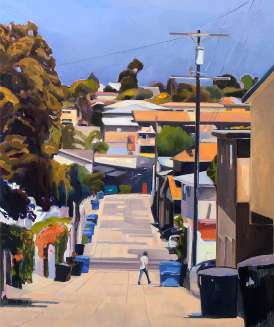
BRIAN LOTTI – KONONO NO. 1
This is a really snappy canvas. It reminds me of Wayne Thiebaud doing genre painting. The difference is that Thiebaud was sort of also concerned with deconstructing the mechanics of light and color in his pictorial views.
In this painting, I see similar instincts to reduce objects and elements of the architecture and landscape to single brushstrokes or small clusters — operating almost like tiles in a mosaic. The color sense is impressive and thoughtful; saturated without being too intense. This reminds me of Diebenkorn too in a way. Further, it’s almost like the artist is creating surface texture by stepped gradients in the pigment, so that the colored shapes build into a picture, again, like tiles or softened pixels.
The way the space is both compressed and extends upward and toward the viewer is both naturalistic and a bit abstract in its stylization. It both looks like the place it depicts even though it is not done in a realist style, and it looks like a painting in that technique is not hidden, the artifice is right out there.
It’s a little bit quaint in its selection of classic low-key subject matter, but by the same token, it accomplishes one main goal of art — to show us back the familiar world in a new and unexpected way.

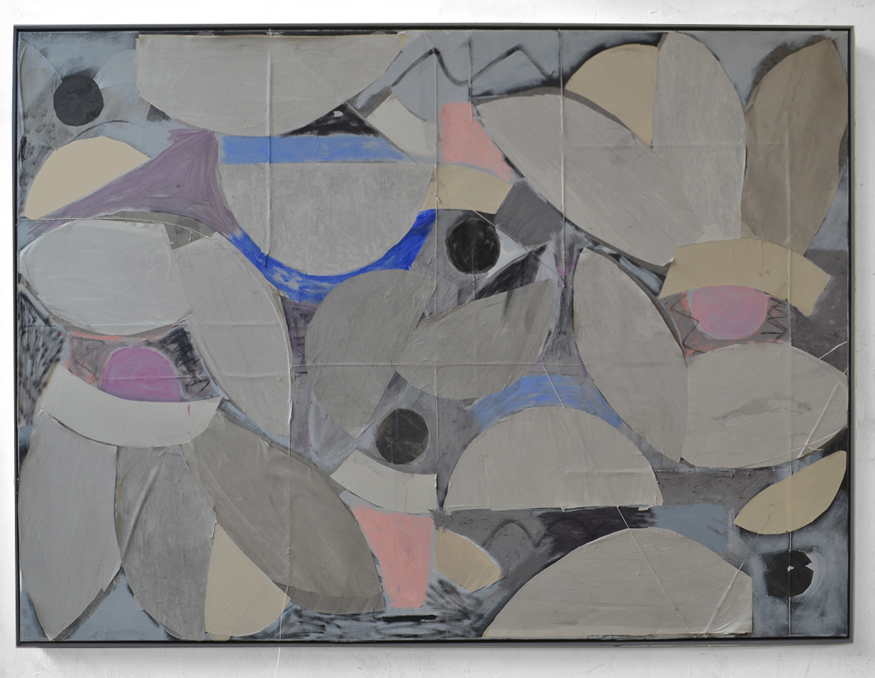
NICK JENSEN – MIRROR IMAGE
This feels like student work, or else like a somewhat rushed study for something to be more properly executed later.
It has a preparatory, sketchy quality despite the thickness of its surface. The rough edges feel undone rather than raw in a meaningful way. The motif echoes certain late 19th-century and turn of the century experiments with abstraction in painting, but it’s a bit clumsy. Its relative messiness could succeed as painterliness, but it doesn’t quite read that way.
I like the way the painted surface seems to highlight and accentuate the seams between what look like collaged elements under the painted ground; and the insertion of the black spheres and the filling-in of the negative spaces between the half-circles do combine to give the overall thing the geological quality of a quarry or rockslide, which is reinforced in the slate palette.
The bits of artificial color are maybe meant as winks to the abstract nature of the work, but in the end they are just kind of distractions. Leaving it in shades of grey would have at least imparted a psychological mood profile to the scene.
It seems more like a messy start than a strong finish.
Related Posts
Comments
Popular
-
 WHAT WOULD MAKE SKATERS DITCH THE BIG SHOE BRANDS?
We asked younger skaters how small shoe brands could win back their business from the big budget behemoths.
-
 MY EXPERIENCES IN SKATEBOARDING
"I've been terrified of garnering the reputation of 'ramp-tramp' or 'pro-ho' just from spending time with skaters."
-
 MEET UNITY, SKATEBOARDING’S MOST PROGRESSIVE CREW
"Never has my gay life intersected with my skateboarding life. If anything, maybe I’d worked to pull them apart."
-
 WHAT HAPPENED TO GERSHON MOSLEY?
From punching Andrew Reynolds, to not getting "pimped" by the industry, Gershon covers everything you wanted to know.
-
 HOW CAN WE HELP KEEP SKATE SHOPS ALIVE?
For years brands and skaters have blindly cried "support your local," but we asked shop owners about other ways we can all provide actual help.

January 22, 2018 3:30 pm
I love this feature! Hopeful for a part 3
January 22, 2018 3:45 pm
thanks yo! should we keep the audio option going too? anything else we can do to make it better for you / you’d like to see?
-ian
January 22, 2018 5:07 pm
It is perfect!
January 22, 2018 5:12 pm
audio is perfect
January 22, 2018 5:34 pm
You should get her to review a actual skate photo. Audio option is sick, keep it.
January 23, 2018 3:02 am
It would be cool if she gave her thoughts on some iconic deck graphics
January 24, 2018 1:16 pm
audio definitely makes it rad, why not make it a video?
January 25, 2018 10:37 pm
Can you get a second opinion? I’d like to hear a viewpoint from another art critic to see where they differ or match-up.
Also a fan of this feature.
February 1, 2018 2:31 am
seconding dewgee, a video option would be amazing
February 2, 2018 12:25 pm
Very nice feature, and the audio is very nice to have. To actually listen to her while looking at the image.
More please!
February 6, 2018 2:14 pm
Loved it! Definitely keep the audio going. Or do video if possible!
January 22, 2018 3:38 pm
plis part 3
January 22, 2018 3:46 pm
she’s pretty spot on. i’d like to get her views on actual sets of art by people (like say a solo show by hsu, childress, etc)
January 22, 2018 4:17 pm
^ what he said! She’s good.
January 22, 2018 3:49 pm
This was great. The addition of audio was a great idea!