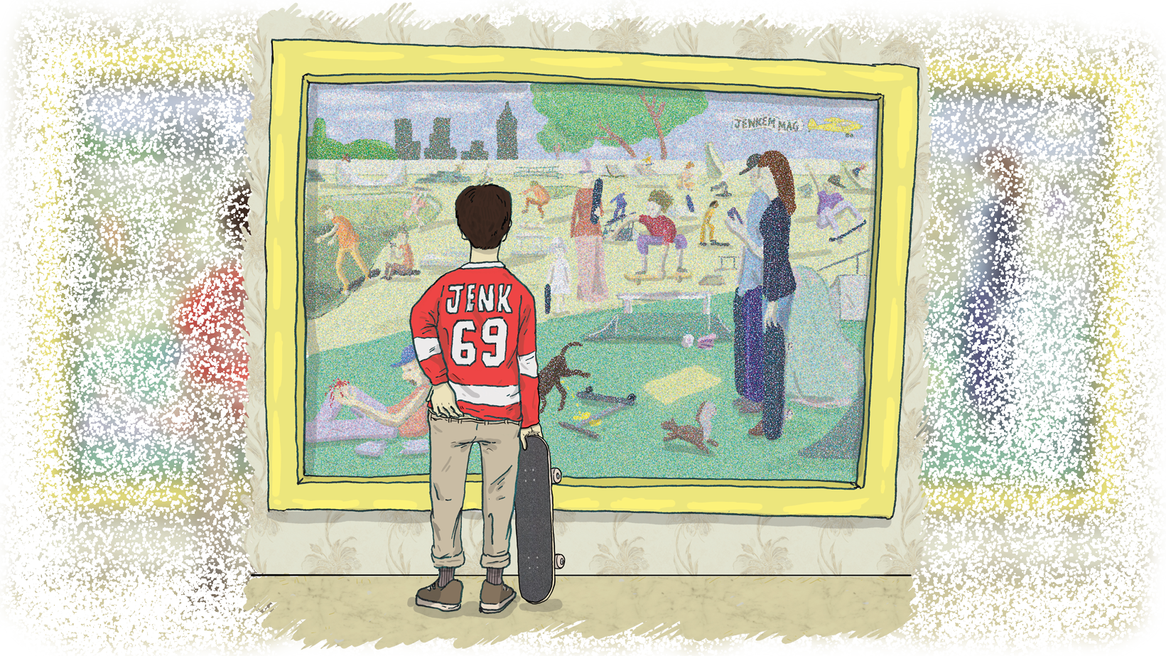
Since skateboarders and skate artists are in constant need of judgement, we present to you round 3 of “Critic vs Skart” with real-life art critic, Shana Nys Dambrot. If you haven’t seen the previous rounds, Shana is here to offer an outsider’s perspective on artwork made by some of our favorite skaters.
If you asked Shana to go in on some nerdy art theorizing or histories behind the most famous paintings, she could completely school you. But if you asked her to name Mark Gonzalez’s first board sponsor, you might have her stumped, which makes her perfect for this segment. Her responses to skater-made art won’t be influenced by how “cool” the skaters are or kids are saying about them on the SLAP message boards.
So without any information on the skart pieces in question, Shana sent us her critiques in writing and audio recordings. You don’t have to leave you house anymore to go to an art museum, and now you get the curator’s tour too!


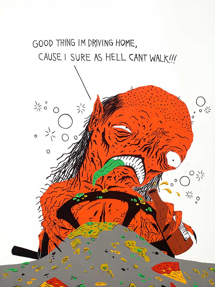
NECKFACE – piece from “No Mercy for the Weak”
This is so nasty it’s hilarious. It’s so self-contained it’s almost beyond critique. Repulsive but not grotesque, a caricature without a target, a kind of lower life form doing a bad and stupid thing.
Is this America? I don’t want to impute anything remotely political to the artist, but there does seem to be an aspect of social or behavioral critique at play. I’d love to say a warm wave of undigested pizza and beer puke was juvenile — but the thing is, it’s really well drawn! The artist is obviously skilled enough to have done everything on purpose, made every choice, and executed a fully formed vision. In fact, there’s a certain amount of genuine delight in the lavishing of that kind of evocative drawing style and saturated, tertiary palette on such a gross-out.
In other words, it’s too good to be just a joke. The green tongue and the way that color reappears and plays off the heroic orange color — quite apart from the imagery, this is a sophisticated choice that keeps the eye in motion, and brings up the whisper of a seasickness, in visual empathy with the protagonist. The wicked little hairs are disgusting too, but look how precisely placed and rendered they are — again, too good for a one-liner.
At the risk of losing my appetite for pizza, I’d be really curious to see more from this artist.

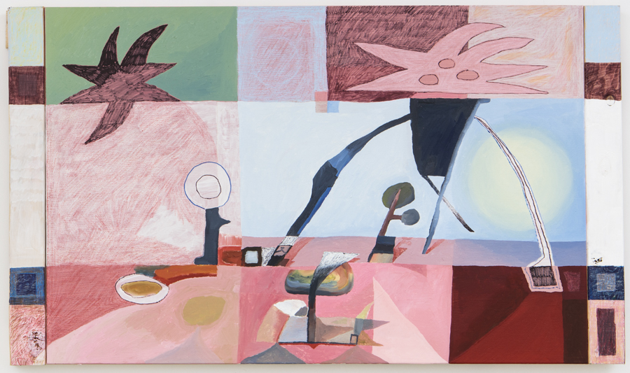
Chris “Mango” Milic – Untitled
This painting is weird. Not necessarily in a bad way, but in a way that will speak to a specific taste for its kind of intentionally awkward abstraction, offbeat palette, and flirtation with imagery.
There’s something curious in its sort of folksy or naive way of drawing and coloring, yet paired with the architectural quirks to its divisions of space, and the choice to add additional side panels to extend and complicate this space. That central sort of alien/biomorphic object/figure has elements that reach across the boundaries between segments, like a hand grasping, or tree roots beneath a surface. So while it’s certainly not a beautiful painting, there’s something to it that encourages the viewer to try to sort out its organization, to try to read it.
It reminds of early art-historical impulses toward abstraction that nevertheless remained oriented in the world, especially in landscape. In the end, I don’t think that it’s fully resolved, but I also make room for the possibility that this ambivalence was deliberate on the part of the artist. But it’s just that, while it’s fine that I or anyone might not get exactly the meaning the artist would wish, this painting leaves me questioning whether there is, in fact, a deeper symbolism or meaning for which it would be possible to search.
For me, as purely a visual matter, it’s somewhat unsatisfying, but I see potential.

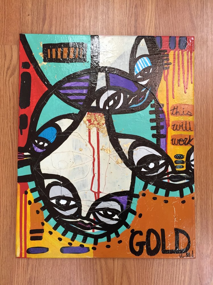
Kris Markovic – G O L D
This is an interesting case. Making allowances for working through a snapshot, in this case, especially I’m pretty confident that some of the more alluring aspects of surface variations and the variations in mixed media are being lost in translation.
That said, this work seems like the not-bad efforts of an amateur with a knack for graphic strokes. The strongest part is the interplay between the thick black lines and the color-blocks they separate. Those are confident areas and evoke stained glass a little, with the small clusters of brush strokes reading like marking time or crude mapping. But I feel like the addition of drips and sort of obscure text elements are more like afterthoughts that are meant to make it look more like “art.” It’s a bit overworked. I’d like to see this artist do less, not more, within single compositions, to embrace the stark, clean, simple, crisp impulses and clean out the complications.
Those flourishes only muddle the scene, where a more straightforward story of line and color and actual brushwork and mark-making would actually be a stronger image. As for the text, I’m not a fan of words that seem coy; I’d like it to be totally unrelated or else doing something narrative. This just seems like it’s trying to be clever, I don’t get it and it doesn’t move me. But I think there are compositional and palette skills this artist could use as a foundation, with some self-editing, to get better.

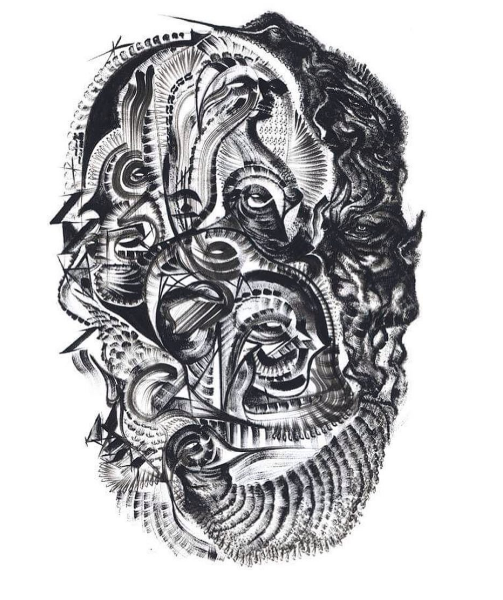
Glen Fox – La tete dans l’ombre
This painting/drawing is very strong.
Whether it’s dry pigment, charcoal or a more calligraphic material, the quality of the lines and shapes in terms of texture strongly retains the feeling of being made by hand, with great expressivity and graphic energy. The riot of swirls, eddies, eyes, marks, and gestures has a lot of detail and variation, and yet the artist also exercises a high level of control and restraint, so that it doesn’t get messy or muddled.
Because of the shape which generally resembles a head, almost in a portraiture mode, it reads like a mask or something with a ritual or mythological aspect. Also, the presence of the many eyes throughout the field of marks reinforces the idea of a human- or spirit-being animating the image — like the many eyes of the Greek god whose story, among other things, explains the eye patterns that appear on the tail-feathers of the peacock.
But at the same time, this artist’s style is not really aligned with that Greek look; it’s more tribal than that, more Eastern-inflected, like Polynesian or a similar kind of more abstract mystical language. Besides all of this marvelous speculation that the image spawns, just on the visual merits, it’s appealing for both its strength and mystery, with a darkness to it even though it’s largely abstract and ambiguous.

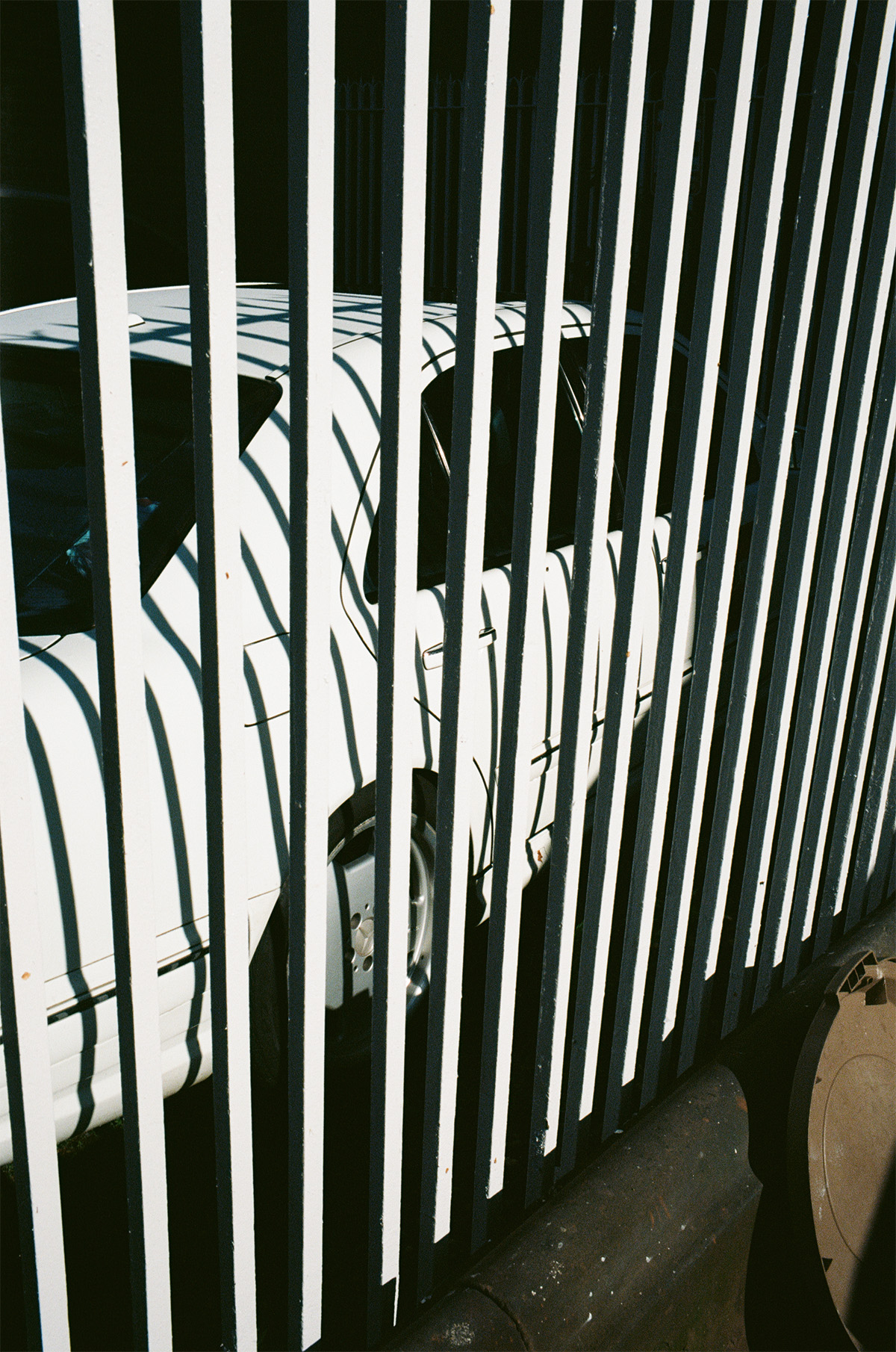
Bobby Dekeyzer – Untitled
This photograph is notable for its stark simplicity and spontaneity — with the distinct feeling of a street photographer’s vigilance for noticing compelling visual occurrences.
Though primarily black and white, because it is actually a color photograph, there’s a certain warm and atmospheric quality of light. It’s terrific how the front of the car seems enveloped in the encroaching shadow, which you also feeling creeping up from the ground as the sun begins to set behind the photographer. The way the white fence and its shadow create the illusion of stripes is visually gripping, and only after deciphering that pattern into objects does the rest of the image resolve itself — into something surprisingly mundane, which is perfect. That’s one thing at which photography excels, representing the everyday in unexpected ways, manifestations of which interest captured the attention of the mid-century avant-garde.
The architectural, geometrical regimentation of the fence gives it a certain aesthetic that reminds me of such experiments in the early 20th century that sought to identify and deconstruct the basic nature of photographic (aka mechanical, or lens-based) vision. But the make of the car places the image among the street photography of the middle of the century, when portability encouraged a generation to go out and document the quirks of the ordinary world, and the extraordinary moments plucked from it.
It’s a bit too subtle for Instagram, and I like that about it.

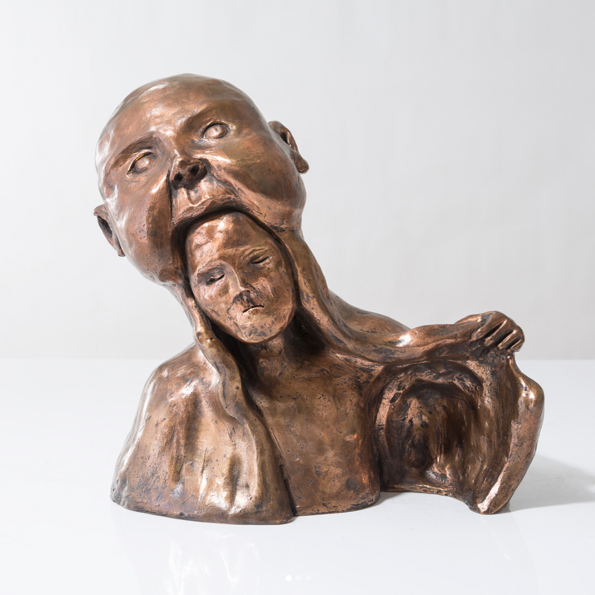
Stefan Janoski – Childhood
There’s a lot of ancient mythology happening here today! The imagery in this sculpture is striking, disturbing even. It takes the mind to a place of the old gods, the myths of creation wherein titans give birth to children by taking them out of their skulls or in some cases devour them whole.
Its stylized roughness and mannerist exaggerations in the faces and torso speak to an art historical aesthetic that relates not to the ancient world, but to the more post-Renaissance, latter-day proto-modernists like Rodin, who reinterpreted these narratives in a rougher, poetic visual and material style. It’s clear that a deep well of symbolic meanings inheres in the work, but even as these tend toward the folkloric, there’s also something that seems quite personal to the artist.
Its execution in bronze gives a warm and tactile quality to the surface that’s more like a totem than a marble or ceramic piece would be; it’s not fragile and it’s not fancy. It’s earthy, earnest, and emotional rather than ceremonial.
My one concern is that while I’m feeling the message or story is likely quite dark, I might be wrong about that; it’s not absolutely clear if I’m witnessing a birth or a death. I wish I could touch it, I feel somehow that feeling its skin and heft would help direct my emotional response to this impressive work.

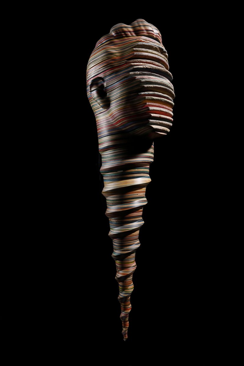
Haroshi – Piece from “Still Pushing Despite the Odds”
First let me say that I am not certain from this image if I am looking at a crisp photograph of a sculptural object, or an illusionistic digital image. (They aren’t allowed to tell me anything!)
Fortunately, sculpture and photography have a lot in common — the way they communicate positive and negative space as well as elements of shadow and texture, for example. So I think it’s okay to proceed… Because either way, I think it’s stunning and rather witty. The surrealist impulse of morphing together a human head and a hardware screw, where the face has been eroded, but the profile remains fine, is solidly imaginative but also familiar.
The exquisite curve of the grooves, the variable coloration, and tactile surface texture of the “material” of which it is made — 3D printing mimicking wood or old stone, perhaps — all give it some aesthetic aspect of the sort of ancient-world partial statuary figures we see in the Greco-Roman or even more so, the Egyptian wing of the museum — with ceremonial headgear and regal posture. Yet the stylistic choices of the imagery are unmistakably contemporary.
It’s both mysterious and accessible, beautiful and plausibly satirical all at once — which is quite a feat in any medium (but I secretly hope it’s a sculpture).
Related Posts
Comments
Popular
-
 MY EXPERIENCES IN SKATEBOARDING
"I've been terrified of garnering the reputation of 'ramp-tramp' or 'pro-ho' just from spending time with skaters."
-
 WHAT WOULD MAKE SKATERS DITCH THE BIG SHOE BRANDS?
We asked younger skaters how small shoe brands could win back their business from the big budget behemoths.
-
 8 ARTISTS REIMAGINE THE INDEPENDENT LOGO
What would an Independent rebrand even look like?
-
 BRIAN SUMNER ON LEAVING THE SKATE INDUSTRY AND FINDING CHRISTIANITY
"People are going to hate you for different stupid reasons, but people shouldn’t be divided over the faith."
-
 WHAT YOUR GRIPTAPE STYLE SAYS ABOUT YOU
Leave it to us to overanalyze one of the least important parts of your skateboard.

April 23, 2018 2:16 pm
I’m amazed at what she got out of these. Aweaome read where it felt like even I learnt something about art.
April 23, 2018 2:28 pm
AYO Jenkem im a normal ass Skartist not a pro. do one on the normies of the skate art world
April 23, 2018 2:33 pm
That was good
April 23, 2018 2:33 pm
Wow good work you guys