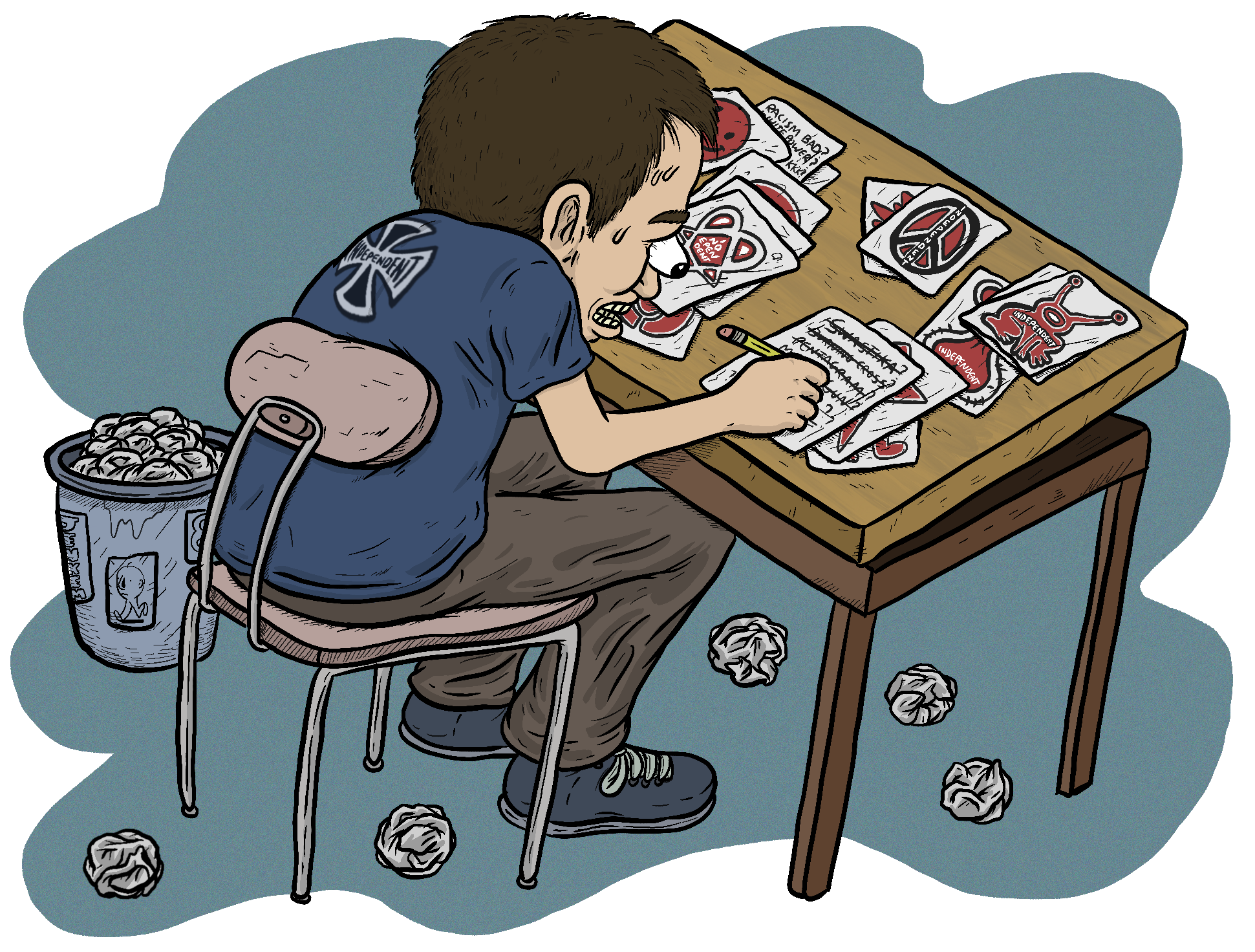
Have you ever heard the debate about the Indy logo? It’s been a conversation inside the skate community for years, if not decades. Some say it looks strikingly similar to something the Nazis used to rock, while others argue the symbol has a significance that predates and supersedes its use in WWII. This has been an especially sharp topic as of late, as questions of racism, bigotry, and antisemitism have forced their way to the forefront of our lives. With all the controversy surrounding the icon, we can’t help but wonder: What would an Independent rebrand even look like?
A quick primer on the Indy logo’s origins: According to the logo’s designer, Jim Phillips, the concept came from “toying with the iron, or Maltese cross,” rounding its corners before taking it to his bosses. They initially thought it was “too Nazi,” so Jim, determined to use that design, scoured his sources until he found a photo of the Pope wearing a similar-looking cross. The higher-ups were satisfied. If it was good enough for the Pope it was good enough for them, and the rest is recent history. They turned the design into the iconic image seen on baseplates, shirt backs, and tattoos all over the world today.
Whatever you might personally think about the logo, there’s no question that the sight can strike a sinister chord with some. We’re not privy to the inner workings of the NHS marketing department, but figured it’d be interesting to hit up a handful of designers to reimagine Indy’s image as an exercise in what is possible for them in the future if they were to explore fresh ideas.

Myles Thompson
I wanted to start with a shape that I thought would fit the truck base well. I wanted to show what it feels like to be independent on your board with a sense of freedom and direction, so I went for something that looks like a giant hill bomb on an open road—something I think a lot of skaters can relate too. Lastly, I wanted the road and the star/sun to also become the letter mark for the ‘I’ in Independent.

Rob Marohn
Working in studios and agencies over the past couple of years, everybody jumps at the thought of rebranding as if you’re intending to destroy a house to build something new and unknown. This is rarely the case in most rebranding projects, and especially with something so powerful like Independent Truck Co. and this little debacle.
Approaching this project I could instantly see the small tweaks that needed to be made. For starters, Independent should be so lucky there is nothing in their name that needs to be changed, but rather the logo within the lockup. I started researching for old symbols that held the same composition as the iron cross but carried a meaning that redeems Independent for this mishap. This is when I came across DWENNIMMEN.
Dwennimmen, literally meaning “ram’s horns,” symbolizes that even the strong have to also be humble. The symbol is a bird’s eye view of two rams butting heads, and the rams’ horns, symbolizes strength and humility through the characteristics of a ram. This simple modification of the logo still carries the true grit that Independent always had, while owning up to the dilemma they are faced with.
You don’t need to do much here to correct a mistake like this while still holding on to a bit of your original integrity. But if you are going to make more new models of trucks with contemporary technologies, you better update your outlook along the way.


Mike Burrill
Independent Truck Company looks toward the future with new branding consisting of:
A new icon: One that brings with it a change in what the company represents. Rather than a cross, an object that’s tethered to the ground, the new icon represents a star, hoisted into the sky as a constant reminder of what it is to be above all others–the best. This symbol also represents a shift in the company’s formerly exclusionary branding toward a message of plurality–its lines extend in all directions, toward all corners of the earth and to humans of all types.
A new tagline: RISE ABOVE. Not just a Black Flag song, but a call to reach for the stars, and to rise above hatred, bigotry, and oppression.
A new typeface: One that’s solid, sturdy, and stable. Just like the trucks.
A new but familiar color: A shift away from black and red to an active orange, a reference to the color of Independent Truck’s tried and true bushings.
Full catalog here.

Adam Abada
As half of the simple machine that allows skateboards to roll, trucks are pretty essential to skateboarding. So truck companies can really get away with selling them however they damn please. And that they do.
I know I’m no marketing wiz, but I think trucks look pretty cool. Generally, I see trucks as a pretty heavy-duty piece of hardware and am impressed with how much they can really withstand. In opposition to most skateboarder’s deep-held beliefs, I don’t really care what trucks I’m riding. I’d rather not be reminded about war when purchasing trucks, though.
Since trucks are the most angular part of the skateboard, I think they work well as an iconic silhouette. I would just use the truck itself as a logo. It’s bold. It’s obvious. It’s not trying too hard and gets the job done. You could use the old Independent font or pick a different one or do whatever sort of variation one wanted.


Anthony Pappalardo, the Writer
In order to truly refresh the Indy brand, I chose to approach this by completely ignoring anything in their origin story other than the year they were founded and their name. I then thought, “What’s the opposite of choosing imagery that conjures up Nazi Germany, oppression, and the intense negativity still present in the colors and visuals.” I drilled back into the actual name of the brand and what being “independent” means. In looking for inspiration, I started by researching African-American graphic designers, starting with Emmett McBain, Archie Boston, and Art Sims.
Using a color palette drawn from African-American heritage I chose a modern typeface and iconography that referenced McBain’s design. I opted for using “78” in one option to offer a nod to jazz and blues records which once were cut at 78 RPM, and to commemorate 1978, the year Independent was founded.


Allan Khorsheed
Say goodbye to revs and smashing lawnmowers and say hello to the new Independent! Rather than breaking glass bottles on the ground in Argentina, we are sipping single-origin cold brew that donates profits back to the communities that farmed the beans. We also include gardening classes and zine-making workshops at all of our demos.
The idea for these designs was to try to separate themselves from the bowl barnacle and trucker hat vibe as much as possible. I’ve redesigned the Iron Cross to become a red flower, and included a couple of fun illustrations for sticker graphics. I can’t picture Independent actually replacing their cross with another icon and expect it to ever hold the same weight, so I decided to do a full rebrand with cute colors and a DIY inspo.
This is obviously going to be extremely offensive to Indy loyalists, but I hope they can also see what’s funny about it too.

Kendall Rumph
For a reimagining of the iconic and problematic Independent logo, I chose to incorporate an Ashanti Adinkra stamp of two crocodiles with a common stomach. The motif represents cooperation and interdependence. A nod to the fact that heritage can be impactful and dynamic without being hateful.

Mike Fagan
The goal in mind was to reshape Independent in light of their iron cross imagery. Is it just good enough to give the company/brand a facelift and a haircut? Maybe, but since this is more of an experiment, I thought I’d give the entire image a makeover and rewrite the narrative. Additionally, I thought of switching up the name to “Indy,” shedding the connection of its former self even further (though the design I prefer didn’t experiment with this idea). “Independent is my dad’s name. He was an asshole. Why don’t you just call me Indy.”
I tried to represent all this visually. I took basic forms and tried to see how to simply reinforce the ideas. I used circles. I tried to have an “I” in it so the composition and had an afterthought of making them resemble trucks. It’s explained pretty well in the diagram, but it kind of comes off a bit contrived.
Full series of attempts here.
Related Posts
Comments
Popular
-
 WE TRIED BUYING RARE NIKE SB DUNKS OFF THE DARK WEB
Could the Dark Web potentially be the plug for future SB drops?
-
 PREMIERE: “MANIMAL” A SHORT FILM ON COREY DUFFEL
Revisiting skating's premier big-gap-slammer.
-
 AN ODE TO DANIEL SHIMIZU
When we heard Shimizu was retiring we knew we had to hit up Joey Sinko for another glorious ode.
-
 HOT TAKE: SKATEBOARDING IS NOT ART
Feedback Ted tries to put an end to the age-old question of whether skateboarding is art.
-
 WE STOPPED BY BAM MARGERA’S HOUSE PARTY
2,000 people, 1 porta potty, and a whole lotta heartagrams.



August 13, 2020 4:46 am
I’ve been skating for around 14 years and have literally not once heard any skater complain about the Indy logo. Why are you making things up? No offense to the designers too, but none of these logos look good at all.
September 16, 2020 9:56 am
Because its logo is heavelly based on nazi/fascist imagery maybe?
September 9, 2020 6:34 pm
lmao the white dude who thought the best way to rebrand a problematic logo was to steal pan-african iconography has really gotta rethink some things
September 16, 2020 9:55 am
Pappalardo´s design looks like any 90s sXe metallic hardcore band branding, so, its awesome.
November 20, 2020 7:55 pm
All of these are terrible. The Indy logo is iconic and badass and clearly not a nazi image